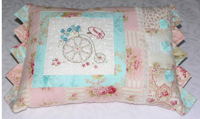
Eight years ago I fell in love with a fabric range designed by Robyn Pandolph, called "Scarborough Fair". Its soft pastels delighted my romantic tastes and I enjoyed making a number of projects from the fat quarters and yardage that I purchased.
However, when I came to design my Block of the Month quilt that year, my heart didn't listen to my head!
My "Thoughts in Thread" quilt just wasn't effective. I took photos of it with different lighting:
but there was a basic flaw in the design, so no amount of photography tricks was going to fix that.
When I analysed the problem, I realised that it was all about contrast. My appliques were great; the embroidered additions looked good; the overall design was pleasing; but I ended up with a very bland quilt, because there was no contrast. The fabric range itself didn't have a lot of tonal difference, but other designs I made from the same material looked good.
In this design I introduced enough contrast for the project to work well:
This one used the fabric more effectively:
One of the mistakes I made in my Thoughts in Thread quilt was to use a tone-on-tone fabric that had far too much going on as a background for the blocks:
Another error was choosing to use a coloured background fabric for some of the blocks. There was just too much uniformity and lack of variety:
Why am I telling you all this? Because I have decided to remake the quilt! Gradually as I rework the blocks I will show you them and you can decide whether I have got it right this time! I plan to work on this when I have no other projects demanding my time, so it could take a while, but I think it is a design that deserves a second chance, so I plan to give it just that.
Happy stitching!
Val


3 comments:
Beautiful
I will enjoy seeing these sweet designs reworked Val. It is still all lovely.
You are amazing, Val! I know I agree with all that you said, so I agree with your decision, but ... well, good thing you like your design! =) You know that someone will be pleased to have the blendy one.
Post a Comment